31st December 2024
Improved Underwriters Dashboard look and feel
Refreshed Underwriters Dashboard
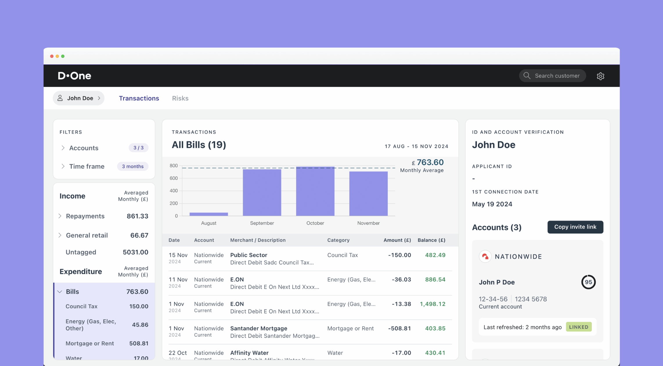
As part of this release, we've refreshed the Underwriters Dashboard with the following updates:
Improved Layout
-
Navigation bar repositioned: Moved to the top to provide more space, allowing you to view filters, transactions, and insights columns on screens 1280px or wider without horizontal scrolling.
-
User details button: The user’s name is now displayed as a button in the top-left corner; clicking it opens a modal with ID and account information.
-
Cleaner design: Updated font sizes, spacing, and added subtle colours to make the dashboard more readable and easier to navigate.
Faster Filtering
- Previously, filtering could be slow due to large transaction data. We’ve introduced infinite scrolling to load more transactions as you scroll, making filtering smoother and faster.
Refreshed ID and Account Verification
-
Streamlined look: This section has been polished for improved readability at a glance.
-
Name matching score: For accounts with available parties data, a clear name matching score now shows how closely the account name aligns with the applicant’s name.